You can produce a Threatened Species Index tailored to your specific needs if you visit the web visualization tool. You can produces indices for combinations of taxonomic groups (birds, mammals or plants), sub-groups within these broader taxonomic groups, states and territories and conservation statuses. You can now also create trends for the National Priority Species under the Australian Government’s Threatened Species Action Plan 2022-2032.
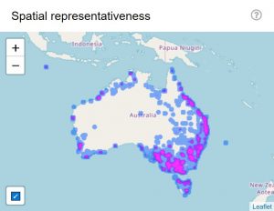
But be careful – some trends are more reliable than others. An index will always be as good as the data it gets. For example, our national bird dataset is quite representative of the eastern states but not as representative for Western Australia, the Northern Territory and the arid zone. We just don’t have much data in these places, as many of the locations are quite remote.
We have developed diagnostics that you can use to understand how representative each trend is. There are a few steps that you can follow to understand how good your trend is:
- Select the combination of possible attributes for which you want to produce a trend.
- Look at the Spatial representativeness map to see how much data there are and where these data come from. Compare this with what you might know of the distributions of species/subspecies within the index you have calculated.
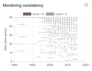
- Look at Monitoring consistency to see how consistently each monitoring location was visited over time. Each row represents a time series where a species/subspecies was monitored with a consistent method at a single site.
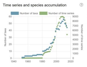
- Go to Time series and species accumulation plot to see how many time series and species/subspecies were used to calculate this index in each year. Are there really enough data for the reference year that you selected? Remember that we can’t produce any trends for less than 3 species/subspecies.
- Adjust the Reference year to let the index start at a year with more data.
- Go to Data Summary to see which species/subspecies were included in this index
- Go to Download CSV to get the aggregated data used to calculate this index.